Additional Settings
The Additional Settings tab controls how the fields of a component appear, behave, and interact within the user interface. While the Component Details tab connects a component to a specific data table, the Additional Settings tab defines how the columns from that table are displayed, organized, and configured for users.
In Supista, a table defines the structure of the data, but Additional Settings define how that data is presented and interacted with inside the component interface.
Administrators use this section to:
• Control which columns appear in the interface
• Arrange the order of fields
• Configure column properties
• Create dependencies between fields
• Organize fields into logical sections
• Display information from related tables
• Configure filters used to search and narrow down records
When the Additional Settings tab is opened, the system automatically loads the Main Table connected to the component and lists all columns from that table so that administrators can configure how those fields behave in the interface.
This section allows administrators to customize the user interface layer of the component without modifying the underlying database structure.
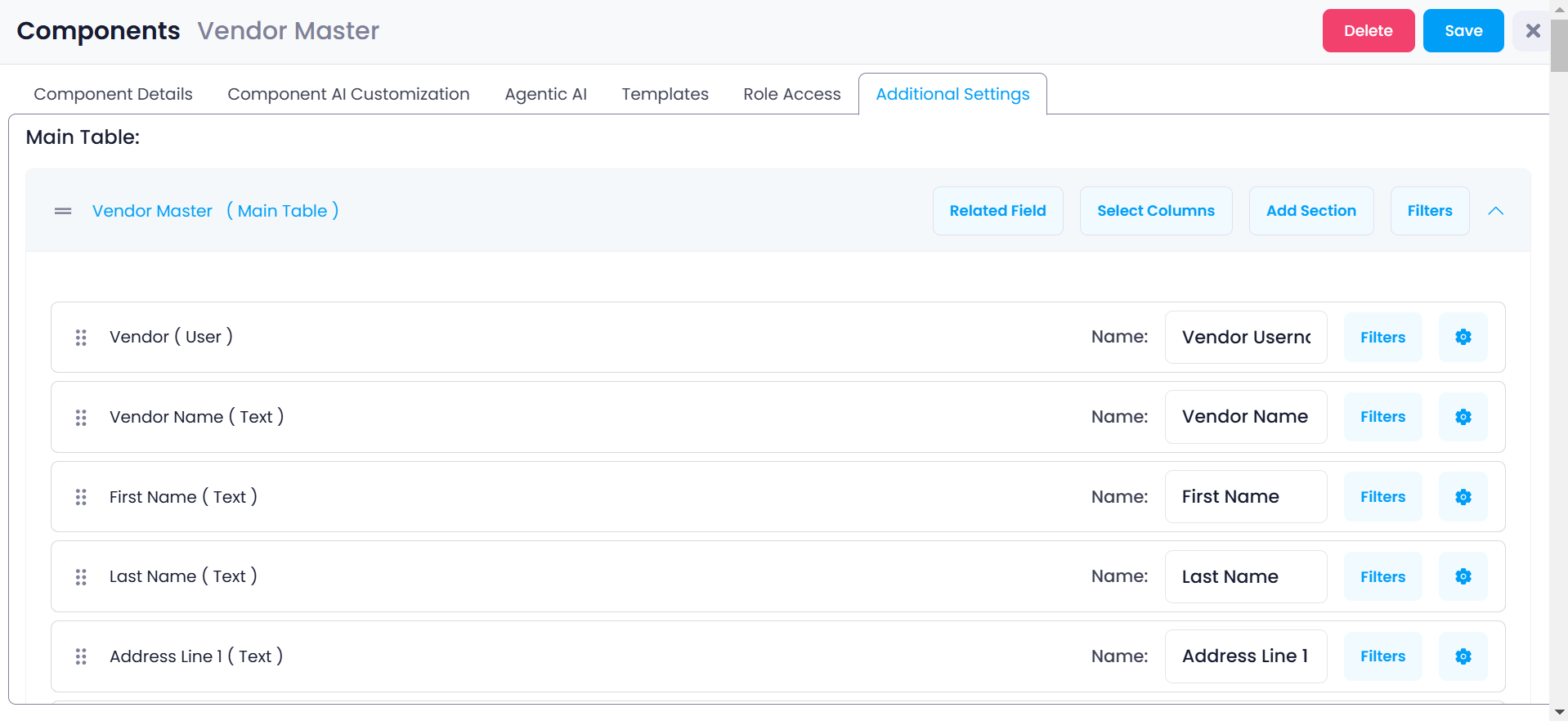
Understanding the Main Table Layout
At the top of the interface, the system displays the Main Table associated with the component.
Example:
Vendor Master (Main Table)
This indicates that the component is built on the Vendor Master table, and the fields listed below belong to this table.
The table structure remains unchanged in the database, but Additional Settings allow administrators to configure how these fields are displayed and organized for users inside the component.
Below this heading, every column from the table is displayed.
Each row contains several controls that allow administrators to modify the behavior of that field in the interface.
These controls include:
• Drag Handle – used to reorder the column
• Column Name and Data Type – identifies the field and its data type
• Filters Button – used to configure filtering rules for the column
• Settings Icon – opens detailed configuration options for that column
Using these controls, administrators can refine the component interface while keeping the database schema intact.
Column Settings
Each column includes a Settings icon (gear icon).
Clicking this icon opens the Column Settings window, which allows administrators to configure how that column behaves inside the component interface.
Column settings determine how fields appear in forms, record views, and tables.
Reordering Columns
Columns can be rearranged using the drag handle.
Changing the order of fields helps administrators organize the interface in a logical way.
Steps
- Locate the column you want to move.
- Click and hold the drag handle.
- Drag the column to the desired position.
- Release the mouse to place the column.
The order defined here determines how fields appear in forms, record views, and data tables.
Example layout:
Vendor Name
Contact Person
Contact Email
Address
Credit Limit
Proper ordering improves usability and ensures that the most important information appears first.
Column Description
The Description field allows administrators to provide additional context about the column.
This description acts as a reference for administrators and users who interact with the component.
Example:
Field: Credit Limit
Description: Maximum credit allowed for this vendor.
Descriptions are useful in complex systems where the purpose of certain fields may not be immediately obvious.
Column Width
The Width setting determines how much horizontal space a field occupies within the component layout.
| Width Option | Description |
|---|---|
| One Fourth | Field occupies 25% of the row |
| One Half | Field occupies 50% of the row |
| Full Width | Field spans the entire row |
Example layout:
Vendor Name → Half Width
Contact Email → Half Width
Address → Full Width
Proper width configuration ensures that forms remain balanced and visually organized.
Show By Default
The Show By Default toggle determines whether the column is visible when the component interface first loads.
If enabled:
The column appears automatically when users open the component.
If disabled:
The column remains stored in the database but does not appear in the interface unless explicitly enabled later.
This allows administrators to simplify the interface while still preserving the data structure.
Affected Columns
The Affected Columns setting allows administrators to create dependencies between fields.
A dependency means that changes in one column can affect another column.
For example:
Column A → Vendor Type
Column B → Import License Number
If the value of Vendor Type changes, the system may reset the Import License Number field to null.
This mechanism helps maintain data consistency when fields depend on one another.
Field dependencies are commonly used when:
• One field determines the validity of another field
• Certain values invalidate related fields
• A change in category affects dependent inputs
This allows administrators to create dynamic forms that respond to user input.
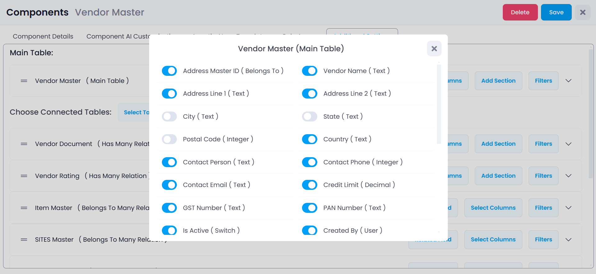
Select Columns
The Select Columns feature allows administrators to control which table columns appear in the component interface.
All columns exist in the database, but not all columns need to be displayed to users.
Steps
- Click Select Columns
- A list of all columns from the table will appear
- Enable or disable columns using the toggle
If a column is disabled:
• The column remains in the database
• It simply does not appear in the interface
This allows administrators to hide unnecessary or technical fields from users.
Organizing Fields Using Sections
Large forms can become difficult to navigate when many fields appear in a single list.
The Add Section feature allows administrators to organize fields into logical groups called sections.
Sections improve readability and guide users through the form in a structured way.
Steps
- Click Add Section
- Enter a section name
- Optionally add a description
- Click Create Section
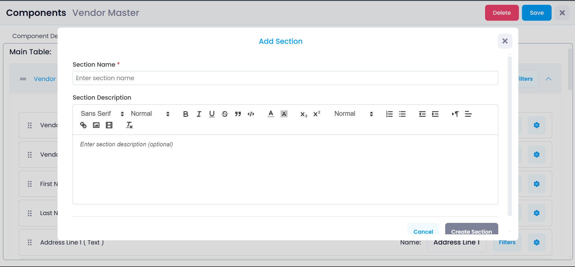
After creating a section, fields can be dragged into that section.
Example structure:
Section: Vendor Information
Fields: Vendor Name, Contact Email
Section: Address Details
Fields: Address Line 1, City, State
Section: Financial Details
Fields: Credit Limit, Payment Terms
Grouping fields into sections improves usability and helps users understand how information is structured.
Connected Tables
Below the main table configuration is the Connected Tables section.
Connected tables are tables that have a relationship with the main table.
These relationships are typically defined as:
• belongsTo
• hasMany
Example:
The Vendor Master table may be connected to:
Vendor Documents
Vendor Ratings
Item Master
Sites Master
These relationships allow administrators to access and configure fields from related tables within the same component.
Each connected table can be configured similarly to the main table.
Administrators can configure:
• Column display
• Sections
• Filters
• Related fields
This allows components to display data that spans multiple related tables.
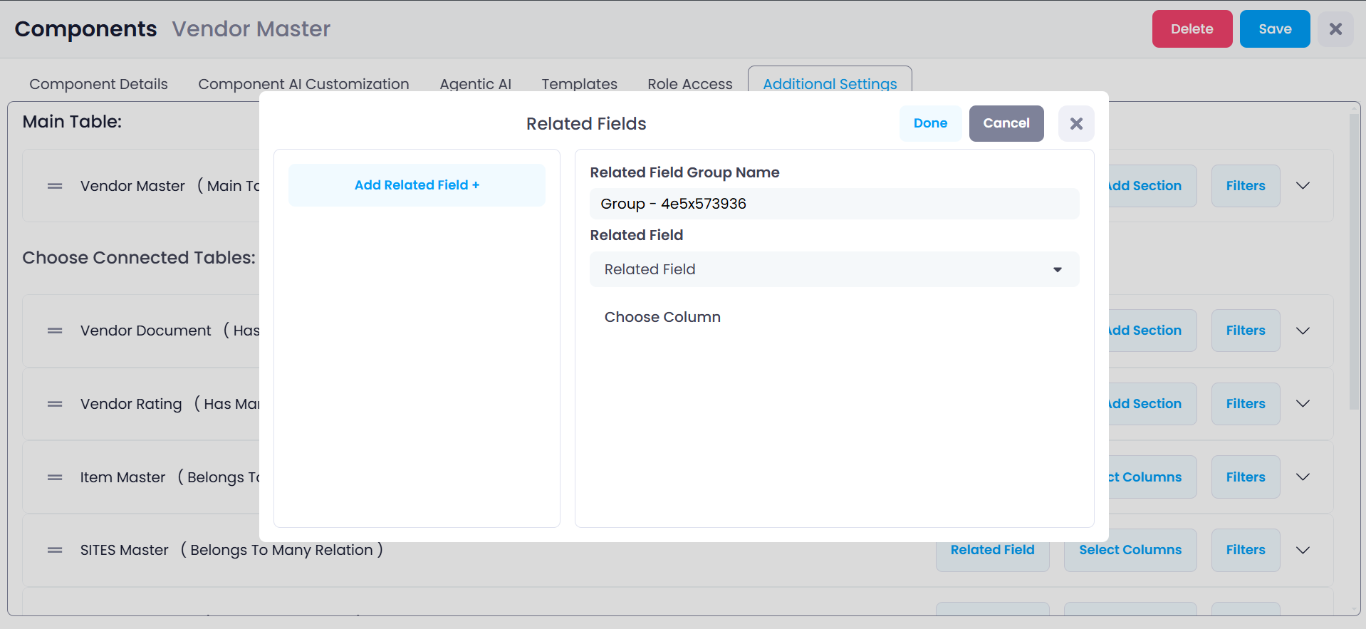
Related Fields
Related Fields allow components to display data from other connected tables.
Instead of duplicating data across tables, related fields allow administrators to reference information from another table.
Example:
A Vendor ID field may reference another table containing:
Vendor Address
Vendor Rating
Vendor Documents
Using related fields, these values can be displayed directly inside the component interface.
This approach avoids data duplication while still allowing users to view related information.
Related Components
If a connected table also has a component created for it, administrators can enable Related Component.
When this option is enabled:
• A navigation link appears in the interface
• Users can open the related component directly
• Records can be connected across components
This improves navigation between related datasets and allows users to move between connected records easily.
Filters
Filters allow administrators to define rules used to search, filter, and narrow down records within a component.
Filters help users quickly locate relevant information, especially when working with large datasets.
Filters can be applied based on different types of fields, including:
• Numeric fields
• Text fields
• Dates
• User-related fields
• Identifier fields
Administrators can also define whether filter values are static values or dynamically generated values.
Filters are a powerful mechanism for controlling how records are displayed and accessed within a component.
Since filters are a large and advanced feature of Supista components, they are explained in detail in a dedicated documentation page.
👉 Read the complete Filters documentation here: Filters Documentation
Why Additional Settings Matter
The Additional Settings tab transforms raw database structures into usable operational interfaces.
While the database table defines what data exists, Additional Settings define how users interact with that data inside the component interface.
Through this configuration administrators can:
• Control field visibility
• Structure forms logically
• Display related information from connected tables
• Configure search and filtering
• Build dynamic and responsive user interfaces
Properly configuring Additional Settings ensures that users interact with data in a clear, efficient, and structured interface, improving usability and reducing operational errors.